Self-publishing has come of age. If you have any doubts about that, you might check out this article on the evolution of publishing over the year 2011. Now, not only can anyone write the book they’ve always wanted to, but they can publish it as well without having to pass the muster of the triumvirate agent-editor-publisher. That’s the good news. The bad news is that publishing without the help and know-how of a professional can be daunting. On many of the online forums to which I subscribe, there are frequent calls for help from newbies who are totally intimidated by the idea of self-publishing.
There are many publishing options, everything from the almost-free, do-it-yourself route to the pay-as-you-go services. If you were to Google publishing services, you’d get oodles of pages of people and companies offering their expertise, all for a price. It’s pretty much a straight across trade: the more of the work you do yourself, the more cheaply you can do it. The more services you require, the more you will pay.
The good news is—it’s not that hard.
I’ve been self-publishing now for several years and have done many different types of books: fiction, non-fiction, art, children’s, memoirs. When I was researching the options, I got a line on CreateSpace, Amazon’s self-publishing subsidiary. What drew me to CreateSpace was the fact that I had about 99% control of my book, although that meant having 99% responsibility for the formatting as well. Scary stuff. What was also extremely attractive was the fact that I could publish for almost nothing. The only required costs were a proof copy and shipping. You can essentially publish a book for no more than maybe $10 (additional proofs require cost and shipping). I do recommend CreateSpace’s $39 Pro Plan, however; it widens the distribution channels, lowers the cost of the book and provides for more royalties. Well worth the price.
So where do you start? If you’ve got your manuscript in Word, it’s a fairly simple matter to format it for publication. The screen shots I’ll use are from Word 2010; earlier versions will look slightly different. Any other word processing program will have similar settings.
 First choose your page size. Most trade paperbacks these days are 6 inches by 9 inches. If my book is roughly 200 pages or better, I will choose this size. If the book is smaller, maybe 150 pages, I will go with 5.5 inches by 8.5. This way the book is still a good size without being too slim. I like a book with a little heft to it.
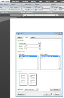
Word’s default page size is 8.5 inches by 11 inches. In order to change the size of your pages, you must go into the Page Layout tab (see screenshot) and click on the Paper tab. The paper size will show Letter 8.5x11in. Hit the drop down arrow and scroll to the bottom of the options listed until you find “custom.” Select that. Now in the Width box, delete whatever is in there and type in 5.5”. In the Height box, delete whatever is there and type in 8.5”. (Use this same method to create a 6” x 9” format.) Note at the bottom of the dialog box where it says Apply to: and make sure “Whole document” is selected. Click on OK.
Now because we haven’t changed the margins yet, the result of this may look terribly wrong. If you want to be safe, save this document with a different name than your original, but we’ll get this one fixed up.
So the next thing to do is choose your margins. Again opening up your Page Setup dialog box, set your margins to 1” in the Top, Bottom, Inside and Outside boxes. Set your gutter to .25”. This is the extra allowance for the inside closest to the spine of the book. Make sure your Orientation is correct (Portrait here, as the pages are taller than they are wide), and where it says Multiple pages, choose “Mirror margins.” This will ensure that your gutter allowance is always toward the spine of the book instead of the outside margin. (You’ll see that in the small Preview figure.) Again where it says Apply to: make sure it says “Whole document.” Click OK.
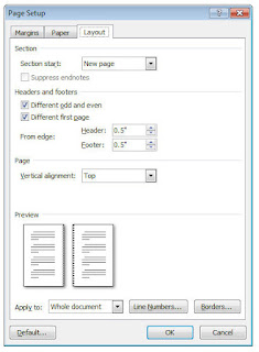
 Your next decisions involve headers, footers and page numbers. If you look at several different books, you’ll see these things in various ways, and no one way is correct. Some books have the book title as the header on every page; some alternate the book title with the author’s name, i.e. author’s name on the even pages, title on the odd pages. In order to do this, open the Page Setup dialog box again and click on the Layout tab. Under Headers and footers, check the two boxes marked Different odd and even, and Different first page. This way you won’t have a header on your first chapter page, which gives it a much cleaner look.
And speaking of chapter pages, there are more style decisions you can make. Again, there is no one “correct” way to do this; it’s all a matter of style. I generally start my chapters about halfway down the page rather than right at the top. I also generally start my chapters on the right-hand (or odd) page, but this is another point that, if you’re worried about a lengthy page count, you can change. It’s perfectly permissible to start a new chapter on the next page after a chapter end, whether it’s on the left or right, with no blank pages in between. Just depends on what you like.
Now that you’ve got the basics done, you can concentrate on the details. This is the time to consider the font that you use. Again, look at other books and see what fonts have been used, how easy they are to read and how appealing they look. Generally speaking, a serif or footed font (like Times New Roman) is thought to be easier to read as the small flourishes tend to “lead” the eye to the next letter and word. A san-serif or non-footed font (like Arial) has a cleaner look but does not have that flowing style. There are many free font collections online where you can find a font that appeals to you.
Finally you might think about drop caps. Drop caps are generally the large (maybe 3 lines tall) first letter or first word of a chapter, often in a different or more elegant font. If your book is about chicken-farming, this may not appeal to you. If your book is a romance, it adds a bit of a flourish to your chapter starts.
When you think you’ve got the book pretty well formatted the way you want it, convert it to a pdf file. While Word does have a built-in function that will convert to pdf, you might be better off to buy the full version of Adobe Acrobat and convert with that. Adobe gives you options like “press quality” resolution, allows you to imbed your own fonts, and you can create your custom page size settings to make sure your pdf looks exactly like your Word document.
Once you’ve got your pdf file, of course, it’s time for the zillionith review, but you’re in the home stretch. Review, edit, tweak, polish (and repeat as necessary), and you’re ready to upload your book to CreateSpace!


This is great, I got this same information from someone else on Authors.com and started doing one of my manuscripts. I think my Word program must have been overwhelmed because it got stuck on page 3. I mean the book was all converted but margins refused to have the gutter in the middle after page 3 - it insisted on having two of that page, which threw off the whole thing. The other problem I had was resizing some graphics. They kept jumping around and stacking up. I may have to rethink that section entirely.
ReplyDeleteImages can be tough in Word. I still have trouble with them jumping around, but I've found I can mitigate some of that by changing the properties. If you go to your Advanced Layout dialog box, click on the Picture Position tab and make sure the box marked "Move with Text" is unchecked, then check the box marked "Lock Anchor." You might still run into some problems if the picture is near the top or bottom of a page and shifts during formatting, but this should take care of most of that problem. Good luck!
ReplyDeleteHey - thanks so much. That worked. I was almost to the point of trying something else entirely at that point. I may have to anyway when it comes time to publish - we'll see.
ReplyDeleteAnna, glad that helped. Also you might try different alignment strategies: square, close, in line with text. Each will do something slightly different with the way the pics line up with the text. Unfortunately this is one of those times when Microsoft tries to read our minds and do "automatically" what it thinks we want, and most of the time it's WRONG. It might take some tweaking, but it can be done. Good luck.
ReplyDeleteWhat I had was a line of autoshapes kinda like a bubble only a different shape, not pictures per-say. I do have another document with pictures in it. I copied (typed) a book on Dungeons & Dragon rules so I could use a document map for navigation - my book was falling apart. I found a pdf with the pics and got fancy and copied them too. It was fun. I finally got the pictures where I want them. I might go and anchor them though. Does the anchor stick the picture to the page or to the text? Or should I click both boxes? It's not important though. I'm not changing it again. This manuscript though may hit a publisher one day.
ReplyDeleteThe anchor sticks the picture to the page, not the text. I generally don't click the text box, but anchor the pic and let the text flow around it.
ReplyDeleteI see. They kinda need to stay where they are in relation to the text though.
ReplyDelete